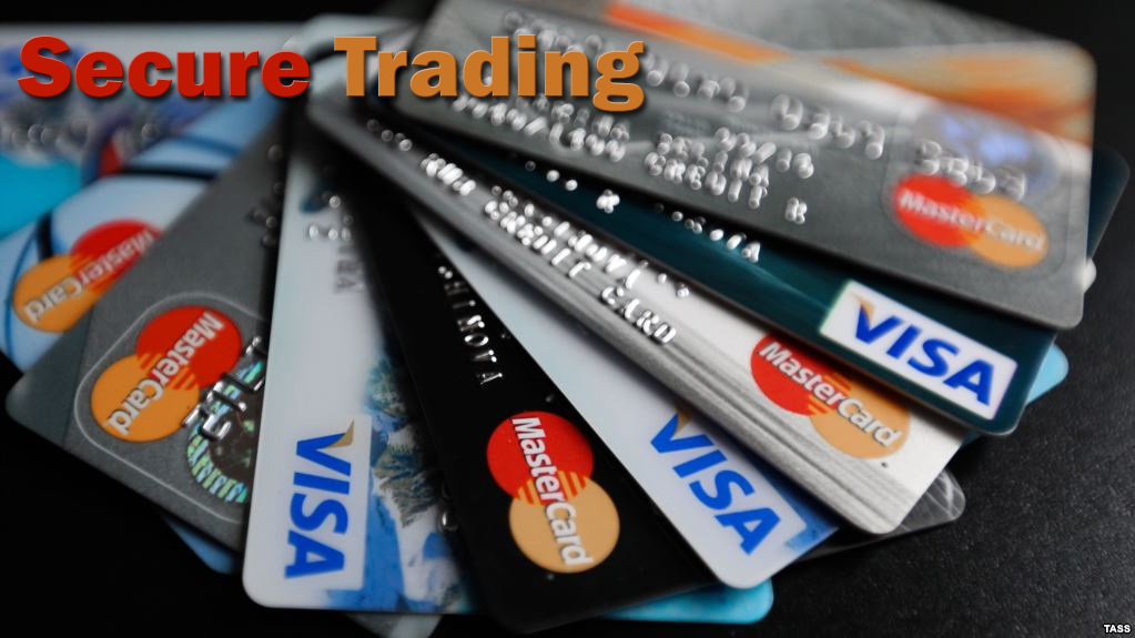
A recent decision by Mastercard has many experts scratching their heads. At the beginning of the year, the company explained in a press release headlined “Mastercard Drops Its Name” that it would be removing its name from its familiar interlocking circles logo. This is just one of two big changes the company has made to its logo in the past two-and-a-half years.

In July 2016, Mastercard refreshed the colours of its 50-year-old interlocking circles as red and yellow. It also chose to alter the longstanding capital “C” in its name to a lower-case “c”. It would appear that this decision was based on emphasizing that Mastercard Inc. is about much more than just card payments. During that period, the name Mastercard was moved from within the circles and placed just below them.
So, why the dramatic change to simple interlocking circles? The ever-changing nature of payments seems to be the driving force behind this decision. As payments industry evolves, so is the Mastercard symbol. (Mastercard refers to its logo as its “symbol”.)
Mastercard recently explained that that its symbol “will stand on its own across cards using the red and yellow brand marks at retail locations both in the physical and digital worlds, and major sponsorship properties.”
“As the consumer and commerce landscape continues to evolve, the Mastercard Symbol represents Mastercard better than one word ever could, and the flexible modern design will allow it to work seamlessly across the digital landscape,” Mastercard went on to explain in the press release.
This change to a nameless logo places Mastercard in the group with companies like Apple, Target and Nike that also do not include their names in their famous brand images. While some are incredibly confused about this decision, others feel that the decision makes sense. Tim Sloane, vice president of payments innovation at Maynard, Mass.-based Mercator Advisory Group Inc., says he is hard-pressed to find a strategy behind this change.
However, Sloane did go on to say that “Perhaps this is preparation for a single buy button where logo space is by nature, and perhaps by contract, limited. Remember, Mastercard and its competitors are always trying to instil brand into every aspect of product usage.”
And what does Mastercard itself have to say? Raja Rajamannar, Mastercard’s chief marketing and communication officer shared in a statement that “reinvention in the digital age calls for modern simplicity. And with more than 80 percent of people spontaneously recognizing the Mastercard symbol without the word ‘mastercard’, we felt ready to take this next step in our brand evolution. We are proud of our rich brand heritage and are excited to see the iconic circles standing on their own.”
Does your company need more information on the latest payment industry news and secure trading? Checkout the helpful information and reviews Best Payment Providers has to offer.
Author Bio: Payment industry expert Taylor Cole is a passionate merchant account expert who understands the complicated world of accepting credit and debit cards at your business. His understanding of the industry and secure trading has helped thousands of business owners save money and time.


